
On this page…
Types of fonts
At the most basic, everyday fonts can be categorized into the following very broad groups:
- Serif
- Sans-serif
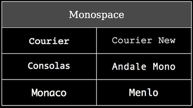
- Monospaced


There are two additional groups that are used far less than the first three:
- Cursive (handwriting)
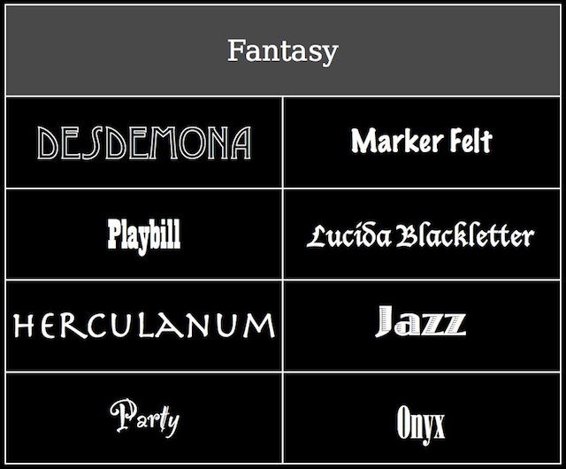
- Fantasy

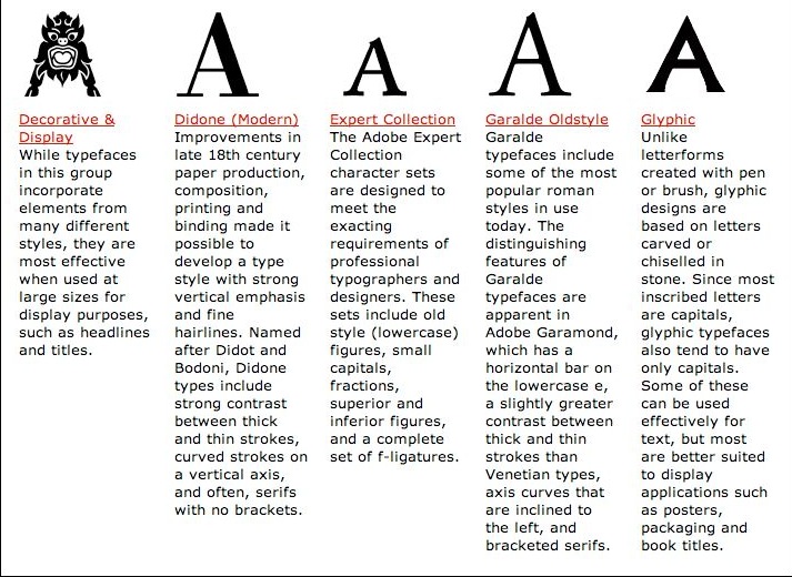
But things can rapidly get far more complex than this. Adobe, for instance, has a webpage called Adobe Type Classifications that categorizes fonts in far more granular ways.
- Adobe Originals
- Blackletter
- Capitals
- Computer Related
- Cyrillic
- Decorative & Display
- Didone (Modern)
- Expert Collection
- Garalde Oldstyle
- Glyphic
- Greek
- Hand-tooled, Inline, Outline, Stencil
- Japanese
- Mathematical
- Monospaced
- OpenType Pro
- Opticals
- Ornamentals
- Phonetic
- Sans Serif: Grotesque, Neo-Grotesque, Geometric and Humanist
- Script
- Slab Serif
- Small Caps & Old Style Figures
- Swash
- Symbol
- Transitional
- Venetian Oldstyle
Fortunately, you really don't need to worry about those unless you decide to make typography your hobby or your job.
Widths
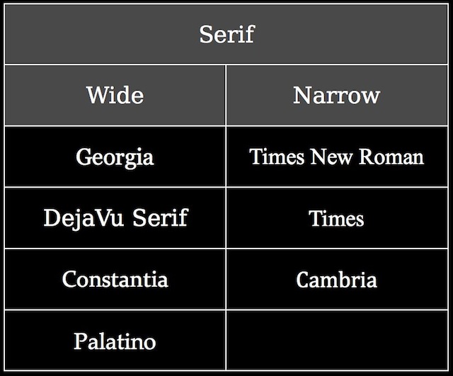
Fonts that are serif, sans-serif, & monospace can also be classified as wide or narrow, as you can see in the following figures:
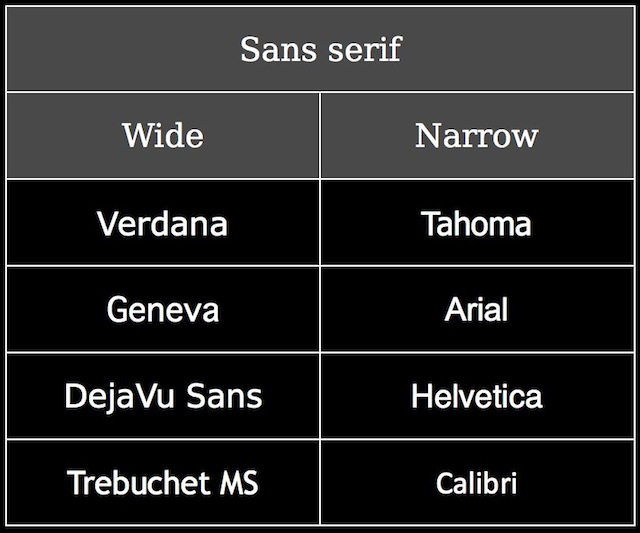
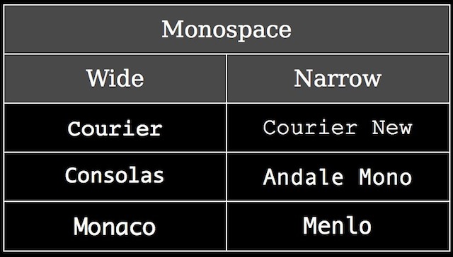
When you're creating font stacks (more on those soon), you want to group serif or sans-serif fonts together. But you also want to group wide or narrow fonts together as well. In other words, you would not do this:
p {
    font-family: Arial, "Times New Roman", sans-serif;
}
In that example, you've mixed sans-serif (Arial) with serif (Times New Roman). But this would also be wrong:
p {
    font-family: Verdana, Arial, sans-serif;
}
Both Verdana & Arial are sans-serif fonts, but Verdana is wide, while Arial is narrow. This doesn't make a whole lot of sense. Instead, you should do something like this:
p {
    font-family: DejaVu Sans, Verdana, Geneva, sans-serif;
}
All of the fonts in that stack are wide sans-serif fonts, so they all logically go together.
For more on this concept, read The Myth of 'Web-Safe' Fonts.
Measure
The length of a line should be pleasing to the eye & facilitate reading. Too short means your eye whips back & forth:
Lorem ipsum dolor sit amet, consectetur adipisicing elit, sed do eiusmod tempor incididunt ut labore et dolore magna aliqua.
Justify the text & it looks even worse:
Lorem ipsum dolor sit amet, consectetur adipisicing elit, sed do eiusmod tempor incididunt ut labore et dolore magna aliqua.
Too long & it's actually harder to read because your eye has trouble finding the beginning of the next line (it's more obvious if you make your window as wide as possible):
Lorem ipsum dolor sit amet, consectetur adipisicing elit, sed do eiusmod tempor incididunt ut labore et dolore magna aliqua. Ut enim ad minim veniam, quis nostrud exercitation ullamco laboris nisi ut aliquip ex ea commodo consequat. Duis aute irure dolor in reprehenderit in voluptate velit esse cillum dolore eu fugiat nulla pariatur. Excepteur sint occaecat cupidatat non proident, sunt in culpa qui officia deserunt mollit anim id est laborum.
Justifying the text makes it look bad too (so hopefully, you're seeing that justifying text via CSS just ain't a good idea):
Lorem ipsum dolor sit amet, consectetur adipisicing elit, sed do eiusmod tempor incididunt ut labore et dolore magna aliqua. Ut enim ad minim veniam, quis nostrud exercitation ullamco laboris nisi ut aliquip ex ea commodo consequat. Duis aute irure dolor in reprehenderit in voluptate velit esse cillum dolore eu fugiat nulla pariatur. Excepteur sint occaecat cupidatat non proident, sunt in culpa qui officia deserunt mollit anim id est laborum.
Shoot for between 50-60 characters, including spaces:
Lorem ipsum dolor sit amet, consectetur adipisicing elit, sed do eiusmod tempor incididunt ut labore et dolore magna aliqua. Ut enim ad minim veniam, quis nostrud exercitation ullamco laboris nisi ut aliquip ex ea commodo consequat. Duis aute irure dolor in reprehenderit in voluptate velit esse cillum dolore eu fugiat nulla pariatur. Excepteur sint occaecat cupidatat non proident, sunt in culpa qui officia deserunt mollit anim id est laborum.
How'd I do that? With this CSS:
p {
    width: 50em;
}
Even better is specifying a minimum & maximum width, so the user can make some adjustments, but things are still kept readable. Use CSS like this:
p {
    min-width: 50em;
    max-width: 60em;
}
To get this:
Lorem ipsum dolor sit amet, consectetur adipisicing elit, sed do eiusmod tempor incididunt ut labore et dolore magna aliqua. Ut enim ad minim veniam, quis nostrud exercitation ullamco laboris nisi ut aliquip ex ea commodo consequat. Duis aute irure dolor in reprehenderit in voluptate velit esse cillum dolore eu fugiat nulla pariatur. Excepteur sint occaecat cupidatat non proident, sunt in culpa qui officia deserunt mollit anim id est laborum.
Leading
Leading is the space between lines of type. It's very important for readability.
Some rules:
- The longer the measure, the more leading is needed.
- The larger the font, the less leading is needed.
Here's a paragraph with a 16px font, with a leading of 0.8. First the CSS:
p {
    font-family: Verdana, Geneva, sans-serif;
    font-size: 16px;
    line-height: 0.8;
}
Then the results:
Lorem ipsum dolor sit amet, consectetur adipisicing elit, sed do eiusmod tempor incididunt ut labore et dolore magna aliqua. Ut enim ad minim veniam, quis nostrud exercitation ullamco laboris nisi ut aliquip ex ea commodo consequat. Duis aute irure dolor in reprehenderit in voluptate velit esse cillum dolore eu fugiat nulla pariatur.
Here's a paragraph with a 16px font, with a leading of 1.7. First the CSS:
p {
    font-family: Verdana, Geneva, sans-serif;
    font-size: 16px;
    line-height: 1.7;
}
Then the results:
Lorem ipsum dolor sit amet, consectetur adipisicing elit, sed do eiusmod tempor incididunt ut labore et dolore magna aliqua. Ut enim ad minim veniam, quis nostrud exercitation ullamco laboris nisi ut aliquip ex ea commodo consequat. Duis aute irure dolor in reprehenderit in voluptate velit esse cillum dolore eu fugiat nulla pariatur.
Leading ideally should be tweaked on a font-by-font basis, but here's a rough rule of thumb: set leading to 1.3 times your font size.
Here's a paragraph with a 16px font, with a leading of 1.3. First the CSS:
p {
    font-family: Verdana, Geneva, sans-serif;
    font-size: 16px;
    line-height: 1.3;
}
Then the results:
Lorem ipsum dolor sit amet, consectetur adipisicing elit, sed do eiusmod tempor incididunt ut labore et dolore magna aliqua. Ut enim ad minim veniam, quis nostrud exercitation ullamco laboris nisi ut aliquip ex ea commodo consequat. Duis aute irure dolor in reprehenderit in voluptate velit esse cillum dolore eu fugiat nulla pariatur.
Scale
How big should your fonts be?
Here's a range of sizes (all in pixels) to compare:
10
11
12
14
16
18
21
24
36
48
60
72
96
144